Piotr Guziński Senior Test Automation Engineer / Test Lead Avenga Poland
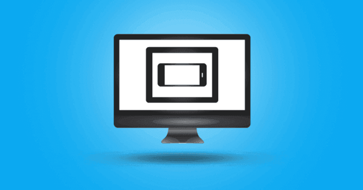
IT tester’s perspective: automated testing of RWD applications using Galen framework
Discover the functionality of this tool and its use in the field of testing responsive web applications.
Galen Framework is an attractive alternative to many, often expensive, RWD application testing technologies. The functionality of this tool and its use in the field of testing responsive web applications is discussed by Piotr Guziński, Test Automation QA Specialist.
What is RWD?
RWD (Responsive Web Design) is one of the techniques for designing web apps. The term was first used in Ethan Marcotte's article for alistapart.com, in which web designer explained how to create applications so that their size, layout and graphics automatically adjust to the browser's window and the screen. As a result, the apps gain in functionality and clarity, both on desktop and mobile devices. The goal can be achieved by using correct style sheets or their fragments.
JavaScript - among other technologies - participates in using RWD, along with respective frameworks supporting this technology: Bootstrap, Foundation, Pure, Gumby, etc. If you want your app to meet the requirements of flexible content presentation and its ergonomic use - essential when it comes to smartphones – is important to you, RWD is a good bet.
Features of an RWD app
In order to have a better understanding of the way application testers can effectively use RWD, let’s briefly discuss the pros and cons of this design method.
Responsive Web Design carries a number of benefits. Below you'll find a review of the most important of them.
Clarity
The app optimises display on its own so the content is more coherent and fits the new format.
Availability
The app is available for every device. It is also economical, as it doesn’t demand investing in more than one version.
Sometimes the mobile version is based on a different engine than the desktop version. As a result, the cost of managing both sites is greater than the cost of maintaining one website developed with RWD technology.
Positioning
RWD apps can be positioned easily. RWD-compliant pages are prioritised in Google search results, which gives them an advantage over non-responsive websites. There is a small catch here though - this applies only to searches on smartphones or tablets.
While introducing such differentiation, Google also provided Mobile Optimization Test. This tool allows testers and programmers to check in a quick and simple manner whether a given website is suited for mobile devices. The results of such an analysis contain screenshots showing how Google views the website on a mobile device and a list of any problems found with respect to website operation on mobile devices.
Despite the pros above, the RWD technology has certain cons as well.
Costs
Maintaining several apps can be expensive - you might want to keep that in mind during website design, coding and implementation stage.
We need to remember that each version of the app requires running a separate test, as well as checking how it works on different browser versions and devices. You can't emulate it on simulators - they might significantly improve testing, but don’t always yield the most reliable results. This means that the application tester needs to have a separate device to test each version of the website.
Time
Whether a smartphone or a tablet, a device needs to download the app’s entire code in order to view it in the interpreter (browser). That's time-consuming, especially for users who don’t have a fast Internet connection.
Graphics / Layout
While designing an app in the RWD technology, we need to consider the limitations of graphics number and size which can be placed on a responsive website. This includes the content presented and interface elements.
Statistics
When it comes to RWD apps, statistics analysis of click maps is quite complex. It requires including different versions of the website, designed for different mobile devices and different screen ratios.
Testing an RWD app
Testing an RWD app should be performed as a cross-browsing process - based on compatibility tests of the web application and scripts, performed on the user's side in different browsers, resolutions and ratios.
From an application tester's point of view, the time spent on testing is an important issue. The main challenge here is the necessity to expand the scope of entire project team’s duties. For example, the website design process is based on breakpoints, which are points of transition between sizes.
On top of this, there are also limitations resulting from the lack of access to devices - whose requirements the apps under development are intended to meet.
Nevertheless, there are several solutions that support RWD application testing - and thus, make the tester’s work easier. That includes especially:
- browser extensions enabling changes in resolution/ratio
- services providing the OS/browser combination via cloud
- frameworks or tools for automatic visual testing
Installing multiple browsers
In its simplest form of cross-browsing, testing a website on multiple browsers is not a major problem - it's enough to install the browsers. These including Firefox, Opera, Chrome, Safari (Mac) and Internet Explorer are industry standard. Most of them enables adjustment of the window to the most popular RWD resolutions (e.g. Google Chrome has an extensive system of developer tools which also allow emulating a given mobile device).
Synchronous testing
Some tools, e.g. GhostLab or DeviceLab, make synchronous testing possible. These programs allow application testers to connect devices in one network and run simultaneous tests in real time on all connected devices.
Web services for cross-browsing
Using web services such as Browserstack or Crossbrowsertesting is a good solution. Their task is to emulate different browsers, operating systems and mobile devices on dedicated remote servers.
Galen
Galen Framework (Open Source) is a support tool for testing responsive apps, designed for UX tests. It contains a number or rules which can be used to describe and verify the app's graphic layout, and features a framework allowing the user to both determine the size of the browser as well as launch application tests in order to verify layout specification. Additionally, Galen makes it possible to generate detailed reports in HTML with screenshots, and to visually compare the image (heatmap).
Galen application
Thanks to Galen, application testers can:
- open a browser in any size and perform visual verification of objects
- perform verification based on the placement of objects in relation to each other
- write the specification in a simple language that is easy to understand
- create a case test suite in the native language or integrate WebDriver's tests with Galen specification files
Selected examples from the rule set:
near
Element near another element
textfield:
    near button 10px left
textfield:
    near button 5 to 15px left
textfield:
    near button 5px top
textfield:
    near button 5px bottom left
textfield:
    near button 5px top, 10px left
below / above
Element below / above another element
caption:
    above description 10 to 20 px
description:
    below caption 10 to 20 px
left-of / right-of
Element to the left of / right of another element
textfield:
    left-of button 10px
button:
    right-of textfield 10 px
inside
Element inside another elements
button:
    inside container 10 px top left

button:
    inside container 10px left right, 20px top bottom
Element partially inside another element
button:
    inside partly container 10px top left
width / height
Width and height of the element
button:
    width 100 px height 25px

button:
    width < 101 px
aligned
Element alignment
menu_item-1:
    aligned horizontally top menu_item-2
centered
Centering of the element
button:
    centered horizontally inside box
on
Centering of the element
user-picture-label:
    on top left edge user-picture 20 px left, 10px bottom
The above examples simply show a natural language that a tester can use while creating an app's visual specification files.
Final word
Described usage of Galen is only a small part of its functionality and characterizing it in its entirety exceeds the scope of this text. Nevertheless, I hope that I have sparked automatic and manual testers' interest in this tool and encourages to familiarise themselves with its documentation – which is only one small step away from implementing Galen in your projects.